

Mobile Menu Bar
por PlumSpace · Diseño y Widgets

por PlumSpace · Diseño y Widgets
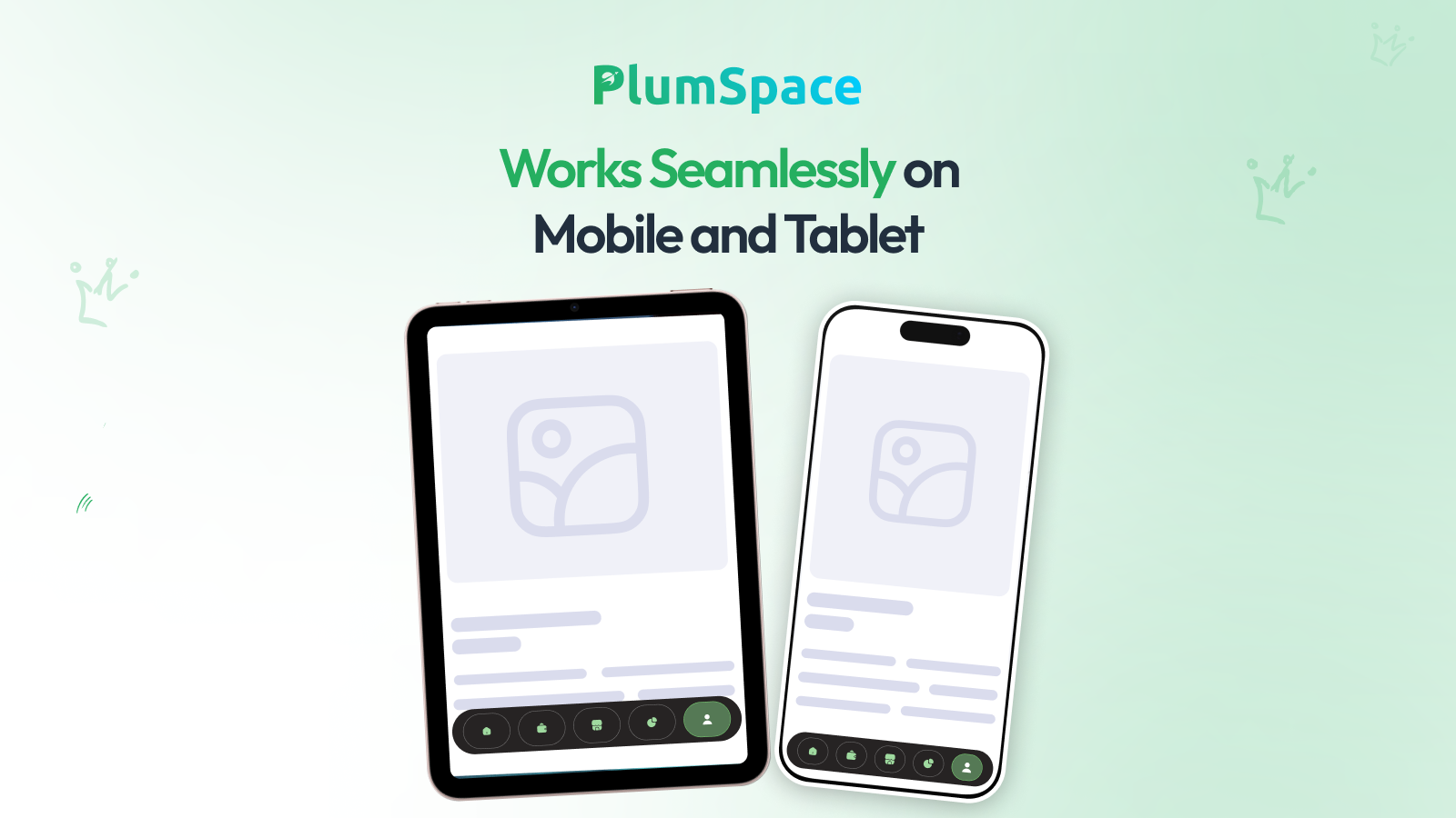
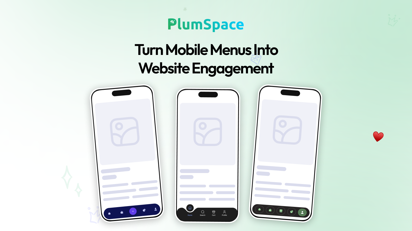
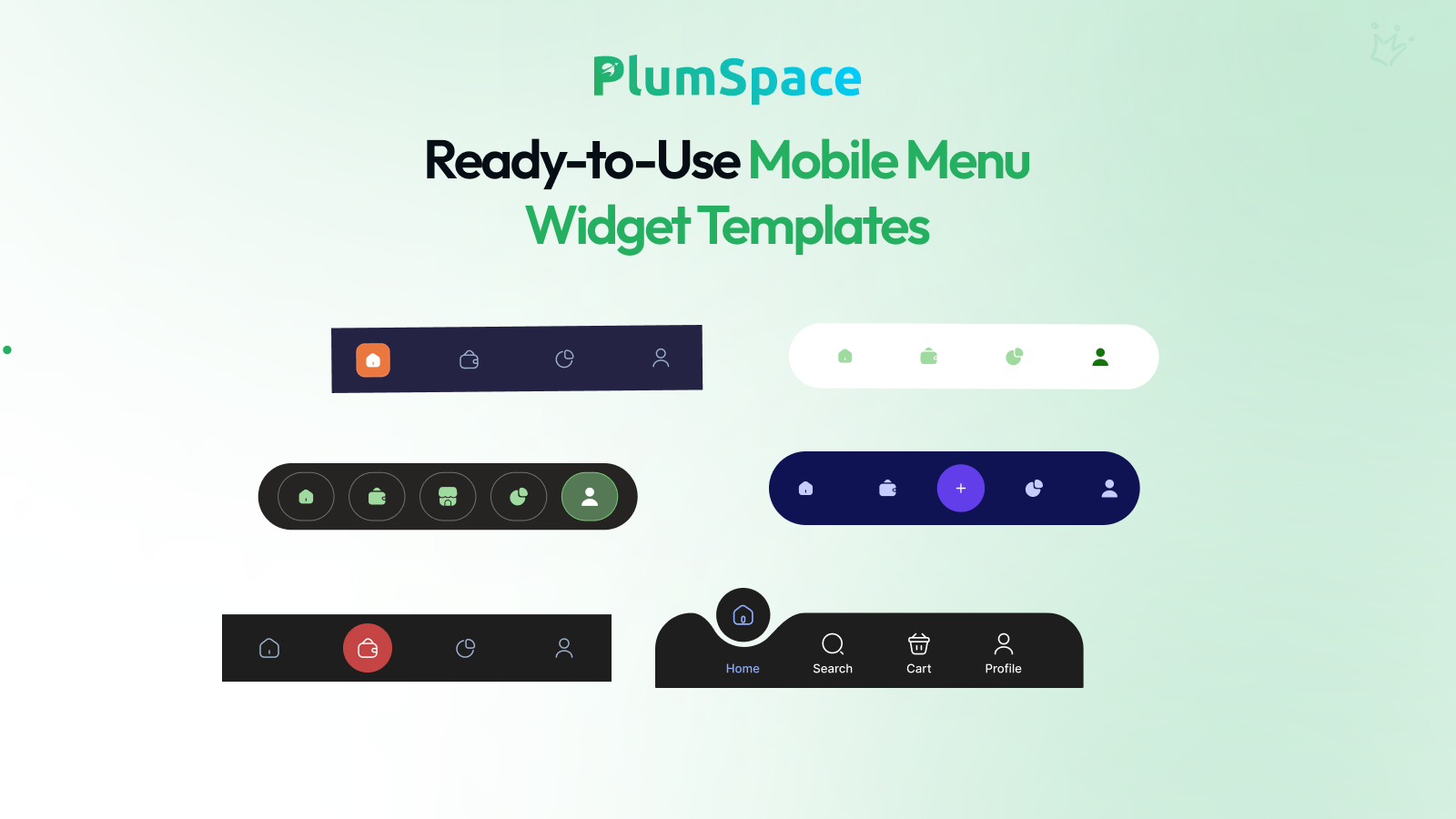
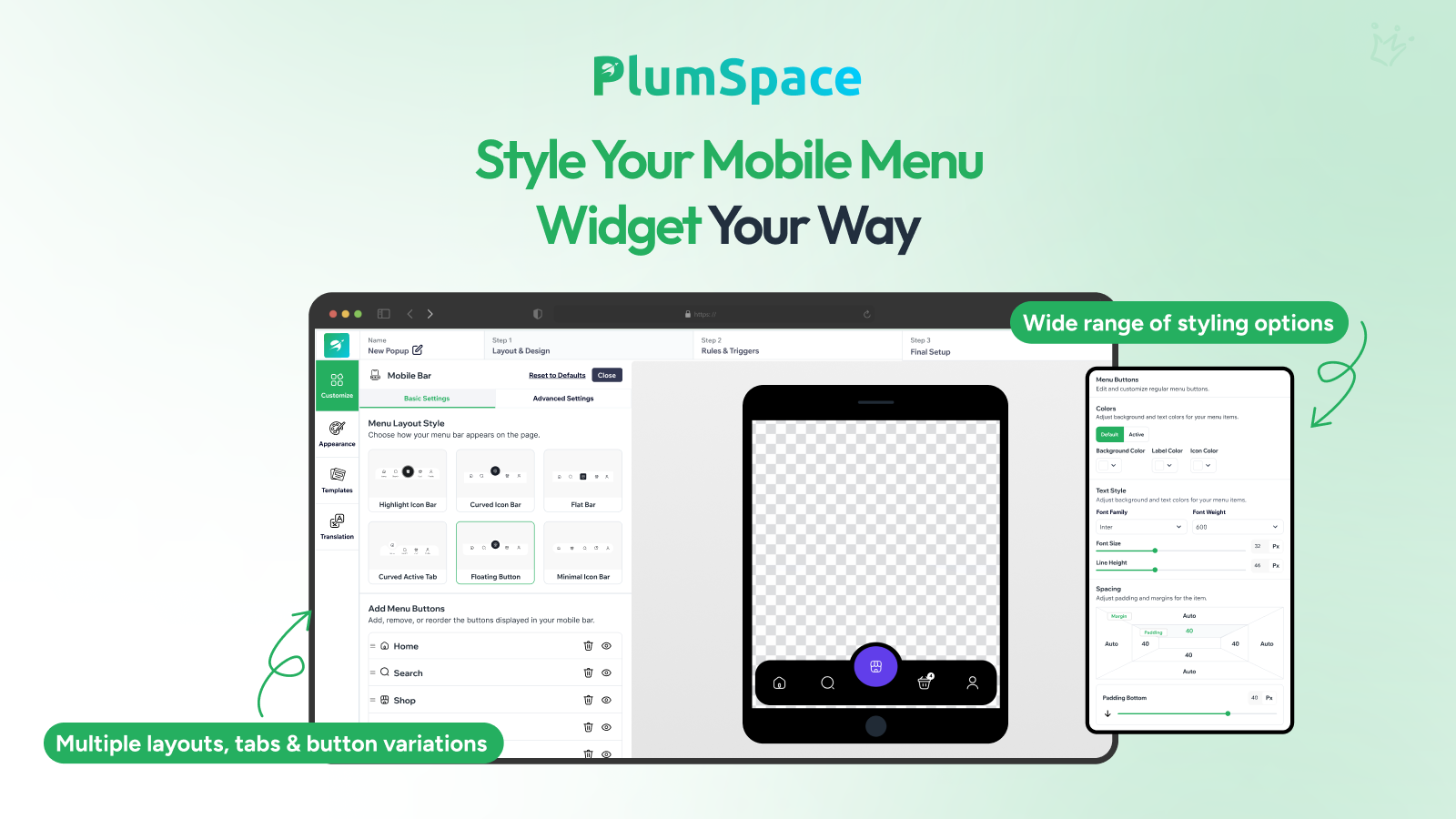
Diseñada específicamente para smartphones y tablets, transforma tu sitio web móvil en una experiencia rápida e intuitiva que imita una aplicación nativa. Los clientes pueden acceder a páginas clave como Inicio, Búsqueda, Tienda y Carrito con un solo toque, eliminando la necesidad de navegar por menús desplegables tradicionales. Con múltiples estilos de diseño, incluyendo botones flotantes, pestañas curvas y barras planas, puedes personalizar completamente los iconos, colores y el espaciado para que se adapten perfectamente a la identidad de tu marca.
Todavía no hay lista de funcionalidades.
Todavía no hay reseñas
Las reseñas de comerciantes aparecerán aquí a medida que compartan su experiencia con Mobile Menu Bar.